

For quite a while Apple iconography has been synonymous with the apocalypse, with corporate clones and drones. An idol of the conformist. A jarring representation of what a tech hungry future looks like - all of us united under the same monochromatic fruit.
Ironically this cult-like representation went entirely against what Apple stands for. We’re all familiar with the Steve Jobs quote:
"Here's to the crazy ones, the misfits, the rebels, the troublemakers, the round pegs in the square holes ... the ones who see things differently -- they're not fond of rules, and they have no respect for the status quo.”
Nothing about this sentiment screams tech dystopia. It screams for creativity, for freedom of thought and expression. It calls for individualism.
In TV and movies, Apple products historically have been used to identify the main character and show their point of difference. The iconic scene from Legally Blonde stands out - there sits Elle Woods with her orange iBook in a classroom full of grey. The simple use of a quintessentially Apple product differentiates her from her peers. A ray of sunshine through clouds. Bright. Different.
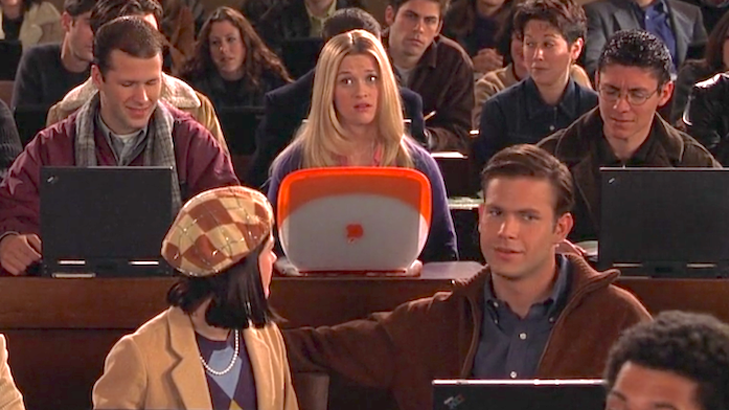
The original iMac’s transparent colours are iconic. Rainbow iPods with white headphones sat in pockets, clipped to shirts and idled in car cup holders. Standing out in a crowd was key to Apple branding, so why on earth did Apple take sides with minimalist trends for so long?
From the early 2000s, colour slowly disappeared from the manufacturer’s products. Instead design leaned towards the bright white, deep black, shiny chromatic silvers, and the occasional rose gold. While colour wasn’t entirely gone from the collection, you’d be more likely to find a simple black or white device settled in your pockets or on your desk.
It seemed like Apple was no longer being made for the dreamers and for the misfits but it was being made for anyone, and the design had to fit the demographic.
Lately though the manufacturer looks to be reconnecting with its roots. The 2021 iMacs have embraced a modern take on the retro aesthetic. Sporting matching mouses, and woven colourful cords to complete the look. The iPhone XR brought with it an array of tones, the Apple Watch Series 7 now comes in blue, green, and red, and at today’s Apple Event we see the HomePod mini bathed in three bright new colours.
In a sea of societal dismay these vibrant new products feel like some much needed optimism. I’m not saying that a colourful speaker is going to solve all of the world’s problems, but it is a happy divergence from the blandness the past two years have brought us.
Sure you can't pick up a bright orange MacBook (yet, at least), and you'll likely cover your hued handset with a case but the shift back to technicolour is a reminder of what Apple was envisioned to do.
The emergence of colour feels like permission from one of the world’s largest companies to step back off that beaten path. To look at things differently again. To challenge the status quo, even if it is as simple as adding a splash of colour.
Anula Wiwatowska
Offsite Editorial Lead | Instagram

Related Articles


